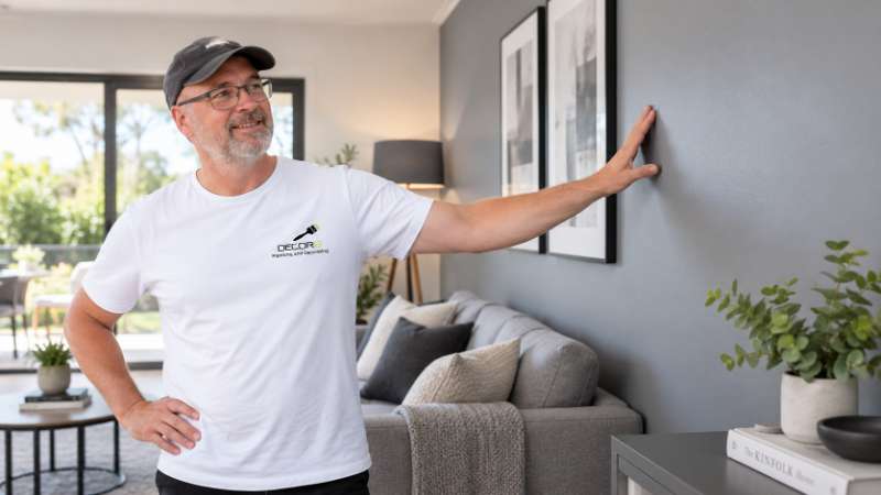
Colour psychology is the study of how the colours we live with shape mood, energy and even sleep, and nowhere does it show up more clearly than on your own walls. Paint colour psychology matters because a room's shade sits closer to the eye, for longer, than almost anything else in the space. Before furniture, lighting or styling ever come into it, the wall colour has already set the emotional tone of a room. For homeowners across the Hills District, Western Sydney and the Blue Mountains planning a repaint this year, understanding what colour actually does to mood is the difference between a room that photographs well and one that feels right to live in, day after day.
Why the Same Room Feels Different in a Different Colour
Two identical rooms, same layout, same light, same furniture, can feel like entirely different spaces once the walls change colour. That's not imagination. In 2018, researchers at the University of Bologna studied a university residence hall made up of six otherwise identical buildings, each painted a different colour, and tracked how residents' mood shifted over more than a year of living in them. Blue interiors were the strongest match for a calm mood, and residents living with blue walls also rated the colour as better suited to studying and concentration than the brighter, more stimulating hues tested.
The takeaway for a home is not that every wall should be blue. Instead colour does mental work whether colour is chosen deliberately or not. Hue, which is the colour saturation, which is how intense colour is and lightness which is how much white or black is mixed into colour all combine to make a room feel energising, restful, cosy or cold. Colour psychology in design is really just paying attention to that effect, on purpose rather than leaving it to chance.
Warm Colours & the Mood They Create
Reds, oranges, terracottas, mustards and warm dusty pinks sit on the warm side of the colour wheel, and they tend to lift a room's energy. Warm colours read as more sociable and alive, associated with appetite, conversation and activity, which is part of why terracotta and warm rust tones have become such popular choices for dining rooms and kitchens over the past few years.
Heavy-handed use of warm colour can easily make a space feel cosy as oppressive-and this is true on a smaller scale or with naturally sunny afternoon-light rooms too. The key is not to shun warm colours entirely, but not to overdo it. Light Terracotta or a soft clay could work well as the dominant hue for a north-facing living room, or as one accent wall within a space of muted tones. Check Decor8's guide to using the 60-30-10 rule to see how to offset a dominant warm hue with other softer support colours in such a way that you make a space feel rich as opposed to bombastic.
Cool Colours & the Mood They Create
Blue, sage, soft greens, dusty lavens and cool greys sit on the side of the color wheel and they generally do the opposite job slowing a room down. Cool colors appear calmer, more spacious and more restful which is why cool colors appear often in bedrooms, bathrooms and home offices. The Bologna residence hall research found blue specifically outperformed every color tested for a sense of calm and residents consistently rated blue as the easiest color to concentrate in.
Cool colours also tend to make a room feel a touch larger and further away, since cooler hues visually recede compared to warm ones. In a smaller room, a soft sage, dusty blue or muted eucalypt green can genuinely open the space up, provided it still gets enough natural light to stop the colour from reading as flat or cold.
Neutrals: The Quiet Workhorses of a Palette
Neutrals are often not credited with having their own 'mood', but warm and cool neutrals act very differently on the wall. A warm neutral-such as oatmeal, warm greige or a soft white with a touch of pink or yellow - grounds the room in comfort and warmth. Cool neutral such as dove grey and crisp, cool white sounds more architecturally sophisticated.
And the neutrals, too, are the reason why colors in other parts of the house can stand out. The practice of 'color drenching' (where your walls, ceiling, skirting, doors and even fittings all look like they're coated in one luxurious shade), for example, only feels intentional rather than dizzying, because there's a clear neutral 'landing spot' in the surrounding space. Decor8 shows you which rooms suit color drenching, and how not to make it look too jarring:
Room-by-Room Application
Colour psychology isn't a single rule applied uniformly through a house, the mood you want in a bedroom is rarely the mood you want in a kitchen. Here's how it tends to play out room by room.
Bedroom
The lowest-energy end of the color palette also works extremely well in bedrooms: a gentle sage, or a dusty blue, or even a warm greige, or a muted heathery tone are all likely to calm instead of alert the senses as one tries to drift off to sleep. Highly saturated warm hues should really be kept out of the bedroom all together - or use just one, in the form of a single highlight, but not the covering color. (Bright red, orange, and hot pink).
Living Room
Living rooms carry much social clout, so a warmer, more tonal palette usually fits better; a warm terracotta, rich olive or deep neutral, as the 60per cent tone. The 60-30-10 is crucial in the living room; just enough warmth to invite, without too many surfaces clambering for attention.
The living room is the one room orientation is also more significant than the colour swatch suggests. It is often when on many Hills District living rooms Decor8 repaints that a north-facing orientation is already carrying plenty of afternoon warmth, so to have Terracotta full strength on all four walls tips the welcome warmth over to an 'overheated' one once there are people living in the space, however beautiful it looked in a shot. Diluting that Terracotta to a feature wall only is often all that is needed to keep your original intention, while letting a slightly warm neutrality manage the rest.
Kitchen
Kitchens do well with colours that feel clean and energising without tipping into stark, a warm white, soft sage or buttery cream keeps the space feeling bright and sociable, which suits a room where people naturally gather.
Home Office
Given the Bologna findings on blue and focus, a home office is one of the few rooms where leaning fully cool makes sense, a soft blue, sage or muted teal supports concentration far better than a warm, stimulating colour competing for attention over a full working day.
If you're weighing up a palette across an entire home rather than a single room, it helps to see the colours together before committing, something a colour consultation can help with, alongside Decor8's interior painting services across the Hills District, Western Sydney and the Blue Mountains.
Frequently Asked Questions
What colour is best for a calming bedroom? Soft, muted cool tones work best, sage green, dusty blue or a warm greige with low saturation. Bright, highly saturated warm colours are best avoided in a bedroom, since they tend to raise energy rather than settle it.
Do warm colours really make a room feel smaller? Not smaller exactly, but closer, warm hues visually advance toward the eye, while cool hues recede. In a small room, a warm colour on every wall can feel more enclosed, whereas the same warm tone as a single accent wall usually reads as cosy rather than cramped.
Should every room in a house use the same colour approach? No. Colour psychology works room by room, based on what each space is used for, restful cool tones for bedrooms and offices, warmer sociable tones for living areas and kitchens. A whole house doesn't need one palette to feel cohesive; it needs a consistent undertone, warm or cool, running through the choices.
How many colours should I use in one room? Most well-balanced rooms work from three tones: a dominant colour covering roughly 60% of the room, a secondary colour for about 30%, and an accent colour for the remaining 10%. Decor8's guide to the 60-30-10 colour rule breaks this down room by room.
Book a Colour Consultation
Colour psychology gives you the theory, but the right shade for your home still depends on your light, your rooms and how you actually want to feel living in them. A colour consultation with Decor8 takes the guesswork out of that, matching mood, undertone and finish to the way your home is actually used, before a single wall gets painted.
Decor8 has been painting homes across the Hills District, Western Sydney and the Blue Mountains for more than 30 years, and every consultation and quote is handled personally. With spring repaint season now underway, it's a good time to get the palette settled before the paint goes on. Book a free onsite quote and colour consultation or call 0404 842 708 to talk through the right palette for your home.