There’s something undeniably captivating about a moody bathroom. Deep hues, layered textures and carefully considered lighting can transform what is often a purely functional space into something immersive and indulgent. When executed well, darker palettes don’t feel cramped or heavy — they feel refined, cocooning and quietly luxurious.
If you’re planning a renovation or new build, drawing inspiration from curated suppliers like Tile Solution Australia can help you translate bold colour ideas into cohesive finishes that elevate the entire room.
Keep reading to explore moody bathroom colour palettes that feel luxurious — and how to bring them to life in a way that suits Australian homes.
Charcoal and Matte Black
Few palettes feel as striking as charcoal layered with matte black. This combination delivers architectural depth while maintaining a sleek, contemporary edge.
Why it works:Charcoal provides softness and warmth compared to pure black, while matte black tapware and fixtures add contrast and definition.
How to style it:
Pair charcoal wall tiles with black-framed shower screens
Introduce timber vanities to prevent the space feeling cold
Use warm LED lighting to soften shadows
To maintain balance, incorporate lighter flooring or subtle veining in stone tiles to avoid overwhelming the room.
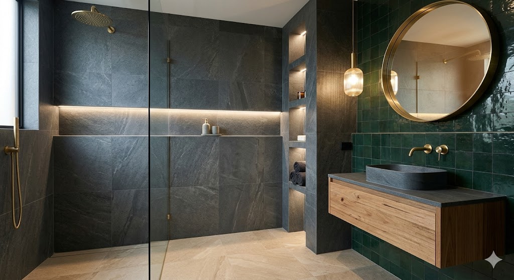
Deep Forest Green and Brushed Brass
Rich green tones are increasingly popular in Australian interiors, and for good reason. Forest green evokes nature and calm while still feeling dramatic.
Why it works:Green is grounding. When paired with brushed brass, it takes on a hotel-inspired sophistication.
How to style it:
Opt for deep green wall tiles or painted cabinetry
Choose brass tapware, mirrors and handles
Add marble-look surfaces with soft gold veining
This palette works beautifully in homes where natural light filters in during the day, creating movement and variation in the green tones.
Navy and Crisp White
For those who want mood without going too dark, navy offers depth with a classic twist.
Why it works:Navy feels refined and timeless. Paired with white, it maintains brightness while still delivering contrast.
How to style it:
Navy feature wall behind the vanity
White floor tiles to reflect light
Chrome or brushed nickel tapware for a tailored finish
This palette suits coastal-inspired homes and Hamptons-style renovations, offering luxury without feeling heavy.
Warm Chocolate and Soft Beige
Luxury doesn’t always mean cool tones. Warm, chocolate browns layered with soft beige or greige can create a rich, spa-like retreat.
Why it works:Earthy tones feel grounded and calming. When layered thoughtfully, they create depth without harsh contrast.
How to style it:
Textured brown tiles in the shower recess
Beige stone-look floor tiles
Timber accents in similar undertones
Add soft lighting and plush towels to reinforce the sense of warmth and comfort.
Burgundy and Blush Undertones
For those wanting something bold and design-forward, burgundy can deliver high-end drama.
Why it works:Deep red tones feel luxurious when balanced with subtle pink or blush undertones.
How to style it:
Burgundy mosaic feature wall
Pale stone vanity top
Matte black or antique brass tapware
This palette works particularly well in powder rooms, where you can afford to take greater creative risks.
Slate Grey and Natural Stone
Slate grey sits comfortably between modern minimalism and earthy sophistication.
Why it works:It provides depth without dominating the space and pairs seamlessly with natural materials.
How to style it:
Large-format slate grey tiles
Travertine or limestone-look flooring
Floating timber vanity
Layering different textures within the same tonal family prevents the bathroom from feeling flat.
How to Make Moody Bathrooms Feel Spacious
A common concern with darker palettes is that they’ll shrink the room. However, thoughtful design can prevent this.Focus on:
Layered lighting (task, ambient and accent)
Reflective surfaces such as mirrors and subtle gloss finishes
Consistent undertones across tiles and cabinetry
Strategic use of lighter flooring or ceilings
In smaller bathrooms, consider using dark colours on walls while keeping the ceiling lighter to preserve height perception.
The Finishing Touches That Define Luxury
Colour alone doesn’t create a luxurious bathroom — it’s the interplay of materials and detail. To enhance a moody palette:
Choose high-quality tiles with texture or subtle variation
Invest in premium tapware finishes
Add oversized mirrors
Incorporate niche shelving for clean, uninterrupted lines
Luxury is often about restraint. Avoid overcrowding the space with too many competing finishes.
Moody bathroom colour palettes are not a passing trend — they’re a sophisticated design direction that can add depth, warmth and personality to your home
Whether you gravitate towards charcoal and black, deep greens, navy or rich earthy tones, the key lies in balance and material selection. When carefully curated, a darker bathroom doesn’t feel confined — it feels intimate, considered and undeniably luxurious.
If you’re ready to embrace bold design choices, start by selecting finishes that complement your home’s overall aesthetic and ensure every element works cohesively together. The result? A bathroom that feels less like a utility space and more like a private retreat.