When it comes to bathroom design, colour plays a pivotal role in setting the tone and atmosphere of the space. Unlike other rooms in the home, bathrooms are often smaller, more functional, and require careful consideration to strike the right balance between practicality and style. Choosing the perfect colour palette can transform a plain bathroom into a calming retreat, a bold design statement, or a timeless classic. Whether you’re renovating or simply refreshing your interiors, the right colours can help maximise light, enhance space, and reflect your personality.
If you’re considering a bathroom renovation, professional guidance from experts like Bulleen Bathrooms+ can make all the difference. With the right advice, you can create a colour scheme that not only looks stunning but also suits your lifestyle and long-term needs.
Why Colour Matters in Bathroom Design
Bathrooms may be among the smallest rooms in the house, but they play an outsized role in daily routines. The colours you choose can influence how you feel when you walk into the space. For instance, soft neutrals can create a calming environment, ideal for unwinding in a bath after a long day. On the other hand, bold hues can energise and add personality, perfect for starting your morning with a sense of vibrancy.
Colour also interacts with natural and artificial light in significant ways. Light, reflective shades make smaller bathrooms appear larger and brighter, while darker tones add depth and drama, creating a sense of luxury. Understanding how colours behave in different lighting conditions is essential for making informed choices.
Timeless Neutrals: White, Beige, and Grey
Neutral palettes are the foundation of classic bathroom design. Crisp white tiles, beige walls, or soft grey cabinetry create a clean backdrop that never goes out of style. These shades also make it easy to introduce textures and finishes such as marble, stone, or wood accents.
- White: Known for its ability to make spaces feel airy and clean, white is a go-to for minimalist bathrooms. Adding natural elements like timber vanities can prevent the space from feeling too clinical.
- Beige and Taupe: Warm neutrals add subtle sophistication while maintaining a sense of comfort. They work beautifully with brushed brass or black fixtures for a modern twist.
- Grey: From light dove grey to deep charcoal, this versatile colour pairs well with both warm and cool accents. It creates an elegant and calming atmosphere, especially when combined with matte finishes.
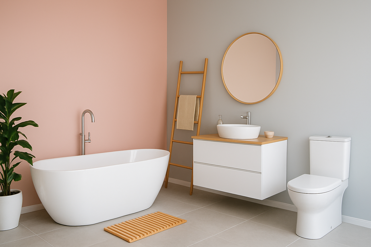
Soft Pastels for a Fresh, Relaxing Look
If you want to step away from a purely neutral palette but still keep things light and soothing, pastels are a fantastic choice. These shades add a hint of colour without overwhelming the senses.
- Soft Blue: Evoking a coastal feel, pale blues bring freshness and tranquillity. Pair with white tiles and chrome fixtures for a crisp finish.
- Mint Green: This subtle shade is ideal for evoking nature-inspired serenity. It works particularly well when balanced with timber or stone elements.
- Blush Pink: A gentle and contemporary option, blush tones add warmth and charm, especially when combined with brass or gold accents.
Pastels can also be layered with neutral tiles or stone to create visual interest while maintaining balance.
Bold and Dramatic Hues
For homeowners who want to make a statement, bold colours in bathrooms can be transformative. Deep shades not only create impact but can also elevate the sense of luxury in the space.
- Navy Blue: Rich and elegant, navy works beautifully in combination with white or marble surfaces. Gold or brass hardware enhances the sophistication.
- Emerald Green: Luxurious and dramatic, emerald pairs well with darker timbers or black accents. It’s particularly striking in powder rooms where you can afford to go bold.
- Black: A modern favourite, black creates drama and depth. Matte black tiles, fixtures, or feature walls bring a sleek and contemporary feel.
Bold hues are best balanced with lighter tones or reflective surfaces to prevent the bathroom from feeling closed in. Using them as feature walls, cabinetry colours, or tiling accents is a clever way to embrace intensity without overwhelming the space.
Earthy and Natural Palettes
Many homeowners today are drawn to earthy tones that bring warmth and connection to nature into their bathrooms. These palettes focus on muted shades inspired by organic elements.
- Warm Terracotta: A growing trend, terracotta tones introduce rustic charm and pair well with timber vanities or stone basins.
- Olive Green: Softer than emerald, olive tones provide an organic feel that blends beautifully with natural stone tiles.
- Sand and Clay: Muted earthy tones work wonders in spa-like bathrooms, enhancing relaxation and grounding the space.
Natural palettes are perfect for those who value a timeless look with a strong sense of comfort and retreat.
Monochrome Minimalism
The timeless appeal of black and white continues to dominate bathroom design. A monochrome palette offers sharp contrast, sophistication, and a sense of order. White subway tiles combined with black grout or accents can create an industrial feel, while marble in black-and-white veining offers an elevated, luxurious aesthetic. The beauty of monochrome lies in its flexibility—by adjusting textures and patterns, you can achieve either modern sleekness or vintage charm.
Accents and Finishing Touches
While choosing a base palette is important, accents make a bathroom truly unique. Towels, rugs, lighting, and decorative accessories offer opportunities to introduce pops of colour without committing to permanent changes. For example, a neutral bathroom can be instantly energised with bright coral or teal towels.
Metallic accents—such as brass, copper, or matte black tapware—are also key players in modern bathrooms, tying the palette together and adding an element of style. Plants are another excellent addition, introducing vibrant greens that work well across most colour schemes.
Tips for Choosing the Right Bathroom Palette
Consider the size of your bathroom: Lighter colours generally make small bathrooms feel larger, while darker tones can add intimacy to larger spaces.
Think about lighting: Natural light enhances colour vibrancy, whereas artificial lighting may alter tones. Always test swatches in your actual space.
Match your personal style: Choose colours that reflect how you want the space to feel: calm, energising, luxurious, or cosy.
Look at long-term appeal: While trends are exciting, it’s worth selecting a palette you’ll still love in years to come.
Balance boldness with neutrality: If you’re drawn to a strong colour, pair it with neutrals to keep the design versatile and timeless.
Choosing the right bathroom colour palette is about more than aesthetics—it’s about creating a space that feels right for you
From calming neutrals to bold statements, each palette has its own charm and impact on mood. Whether you’re after a serene retreat, a chic minimalist look, or a dramatic design statement, colour is the foundation that sets the stage. With the right palette, your bathroom can become one of the most beautiful and enjoyable spaces in your home.